DESIGN
AND BRAND GUIDELINES
Brandbook – Spring 2024

Introduction
Design Guidelines
These guidelines describe the visual and verbal elements that represent BORGH’s corporate identity. This includes our name, logo and other elements such as colour, typography and graphics.
Sending a consistent and controlled message about who we are is essential to presenting a strong, unified image of our company. These guidelines reflect BORGH’s commitment to quality, consistency and style.
The BORGH brand is a valuable corporate asset. It includes the logo, name, colours and identifying elements.
Each of us is responsible for protecting the company’s interests by preventing unauthorized or incorrect use of the BORGH name and marks.
01
Logo
Our logo is the key building block of our identity, the primary visual element that identifies us. The signature is our company name build in a way so it looks like a plug. Our ‘B’ brandmark can’t be used next to the wordmark logo.
Logo introduction
Logo application
Logo elements
Clear space and computation
Incorrect logo applications
Full logotype
The BORGH® corporate logo comprises two versions, the logo symbol and logo type. The logo symbol is a powerful ‘B’, short for the logo type. The logo type is a powerful type in the shape of a plug. BORGH®’s main product.
Recommended formats are:
.eps, .ai, .png
Attention: The use of stylised, animated, hand-drawn or other versions of an unofficial logo is not permitted. This undermines the logo system and brand consistency. Please contact BORGH Trademark Licensing if you have any questions or need further assistance.

Logo
Carefully selected for its modern yet refined, highly legible style, enhanced by the use of capitals in the corporate colour of orange.

Symbol
Consists of a strong ‘B’ element that evokes the culture of design services.

Orange version
This will be used when the background color is orange

Dark version
This will be used when the background color is dark.
Construction,
clear space and computation
It is important to keep the corporate mark clear of any other graphic elements. To regulate this, an exclusion zone has been created around the corporate mark. This exclusion zone indicates the closest any other graphic element or message can be positioned in relation to the mark, the symbol itself and our company name. They have a fixed relationship that should never be altered in any way.
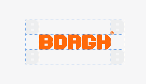
Definition: Whenever you use the logo, it should be surrounded with clear space to ensure its visibility and impact. No graphic elements of any kind should invade this zone.
Computation: To work out the clear space take the height of the logo and divide it in half.
( clear space = height / 2 )
Application on backgrounds
The best way to incorporate the brand logo on different colored backgrounds is to use it in a white color setting. on fotographic backgrounds, it is manditory to allow the logo to be visible by any means necessary. The higher the contrast the better, but the color setting white is also recommended in this application.

Photo version

Orange

Anthracite

Grey
Minimum logo sizes
Logo
Minimum size: 20mm x 3.33mm

Symbol
Minimum size: 5 mm x 4,3 mm

Animated application

02
Typography
Typographic hierarchy is another form of visual hierarchy, a sub-hierarchy in itself in an overall design project. Typographic hierarchy presents type in such a way that the most important words are displayed with the greatest impact, allowing users to scan text for important information.
Typographic hierarchy creates contrast between elements. There are many ways to create a sense of hierarchy. Here are some of the most common techniques used in BORGH layouts.
Corporate fonts
Primary font
Secondary font
Hierarchy
Corporate Fonts
Primary font
Gibson is a sans-serif typeface created by Jamie Chang, Kevin King, Patrick Griffin and Rod McDonald at Canada Type.
Primary font

Regular
a b c d e f g h i j k l m n o p q r s t u v w x y z
A B C D E F G H I J K L M N O P Q R S T U V W X Y Z
Semi Bold
a b c d e f g h i j k l m n o p q r s t u v w x y z
A B C D E F G H I J K L M N O P Q R S T U V W X Y Z
Figures
0 1 2 3 4 5 6 7 8 9
Special characters
~ ` ! @ # $ % ^ & * ( ) – _ + = { } [ ] | | / : ; “ ‘ < > , . ?
Secondary font

Regular
abcdefghijklmnopqrstuvwxyz
ABCDEFGHIJKLMNOPQRSTUVWXYZ
Figures
0123456789
Special characters
~`!@#$%^&*()-_+={}[]||/:;“‘<>,.?
Secondary font
OCR A Std is a digital typeface created by American Type Founders from Adobe Originals.
Usage
Use the OCR A Std font for logo pay-off’s, quote’s and numbers.
03
Hierarchy
Typographic hierarchy serves as a vital aspect of visual hierarchy within a design project, functioning as a sub-hierarchy in the overall composition. It strategically presents lettering in a manner that emphasizes the most important words, allowing users to effortlessly scan the text for key information. By establishing contrast between elements, typographic hierarchy effectively guides the reader’s attention. There are several effective techniques commonly employed to create a sense of hierarchy, particularly in BORGH layouts.
Font hierarchy
Gibson is a sans-serif typeface created by Jamie Chang, Kevin King, Patrick Griffin and Rod McDonald at Canada Type.
Sequencer and title for marketing

Gibson | Semi-bold | Uppercase
Font size: 48pt | Leading: 48pt
Big headlines and titles

Gibson | Semi-bold | Uppercase
Font size: 34pt | Leading: 30pt
Sublines / Sections

Gibson | Semi-bold | Uppercase
Font size: 16pt | Leading: 16pt
Headlines / copy text

Gibson | Regular | Uppercase
Font size: 10pt | Leading: 10pt
Copy text

Gibson | Regular | Normal
Font size: 8pt | Leading: 11pt
Caption text

Gibson | Regular | Normal
Font size: 6pt | Leading: 9pt

04
Colors
Color plays an important role in the BORGH® corporate identity program. The colors below are recommendations for various media. A palette of primary colors has been developed, which comprise the “One Voice” color scheme. Consistent use of these
colors will contribute to the cohesive and harmonious look of the BORGH brand identity across all relevant media. Check with your designer or printer when using the corporate colors that they will be always be consistent.
Primary colors
Secondary colors
Primary colors
BORGH has three official colors: Orange, Anthracite and Black. These colors have become a recognizable identifier for the company.
Usage:
Use them as the dominant color palette for all internal and external visual presentations of the company.
Orange
Anthracite
Black
Secondary colors
Secondary colors are complementary to our official colors, but are not recognizable identifiers for our company. Secondary colors should be used sparingly (less than 10%) of the palette at once.
Usage:
Use them to accent and support the primary colors. Blue is being used for call to action buttons and links.
Gray
Blue

05
Stationery
Stationery is a primary means of communication and it is essential that every application be a consistent reflection of our corporate identity. There is only one approved design format for all corporate and business unit stationery, although there are slight variations in size and content for different regions of the world. This section illustrates approved layouts for standard U.S. business stationery. It includes specifications for typography, color, printing method, paper stock and word processing Stationery brand management guidelines do not include
invoices, bills of lading, credit letters, business forms, checks, e-mail tags or other business processes
Letterhead
Business Cards
The Envelope
E-mail footer
Letterhead
Explanation:
This shows the approved layouts with the primary elements of the BORGH® stationery system for the front- and backside of the letterheads.
Usage:
The letterhead will be used for all official communication that is going out of BORGH® company.
Parameter
Dimensions
297 x 210mm
DIN A4
Weight
120g/m Uncoated
white
Print
Offset
CMYK
Envelope
Explanation:
This shows the approved layout with the primary elements of the BORGH® stationery system for envelopes.
Dimensions
297 x 210mm
DIN A4
Weight
120g/m Uncoated
white
Print
Offset
CMYK

E-mail footer
Explanation:
The logo is animated and the hosting from this logo file is provided by Studio vibe, feel free to contact.
Click the download button. A new screen opens. Select all and copy. Paste in your email signature. Don’t worry if the logo doesn’t appear right away, they will load when sending an email.
Business card
Explanation:
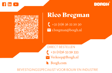
This shows the approved layouts with the primary elements of the BORGH® stationery system for business cards.
Usage:
The business cards will be used for all official contact and communication of BORGH® company. Insert the BORGH® letterhead and send your documents throughout the world.
Dimensions
297 x 210mm
DIN A4
Weight
120g/m Uncoated
white
Print
Offset
CMYK
06
Logo
placement
Logo placement
Explanation:
To place the BORGH® logo in the correct way please use one of the approved styles that are shown on the right. To place the BORGH logo in other ways is not allowed.
Example
297 x 210mm
DIN A4




07
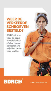
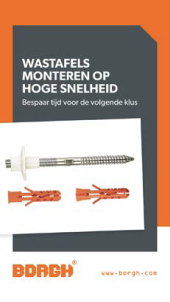
Images and blending modes
Corporate Image
Corporate Image Color
Corporate Image Black and White
Blending Modes and Options
Colored images
Corporate Images are responsible to transfer the values of BORGH to our customers or our potential customers. It is a composite psychological impression that continually changes with the firm’s circumstances, media coverage, performance, pronouncements, etc. BORGH use various corporate advertising techniques to enhance their public image in order to improve their desirability as a supplier, employer, customer, borrower, partner, etc.
Requirements
Desaturate colours
High contrast
Sharp images
Minimalistic look
Modern and businesslike


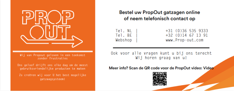
Documenten propout
Dimensions
295 x 115mm
Weight
250/m Uncoated
white
Print
Offset
CMYK

Roll-up banners
Dimensions
1500 x 2000 cm
EA5
Weight
510g/m frontlit
white
Print
Digital
CMYK

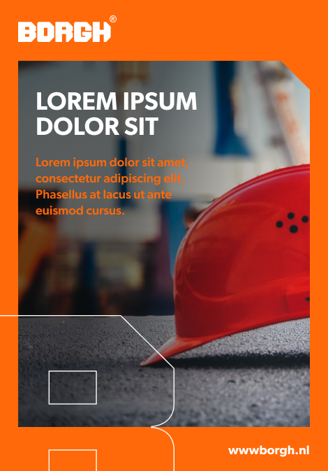
Blending modes for images
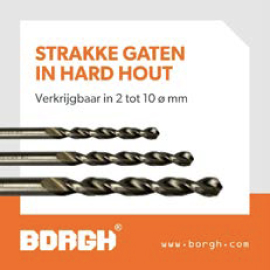
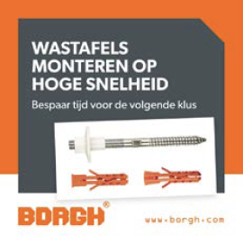
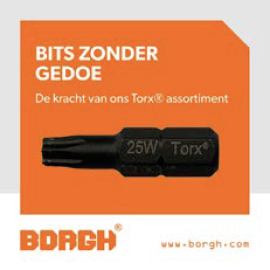
Image effects and blending modes raise the concision and the recognizability of a brand. Also they are able to divide content and other graphical elements that are used in layouts. In the same way the support statement of the used images and raise application possibilities.
How to
1) use it in black and white images colours
2) use a placeholder with a Orange back
3) adjust the layer style to “multiplicate”
Example
1080×1080
Social banner

08
Iconography
Icongraphy
Application
Iconography
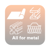
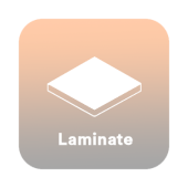
An icon is a pictogram displayed on a screen or print layout in order to help the user navigate through the content in a easier way. The icon itself is a small picture or symbol serving as a quick, “intuitive” representation of a software tool, function or a data file.
How to:
Only use icon with a background
Upscale only proportional




09
Packaging
Corporate Product Packing
Random Borgh Product Packaging
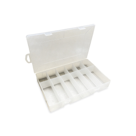
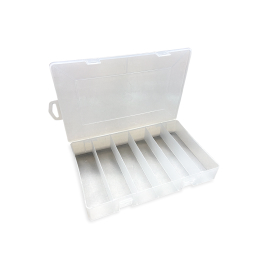
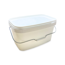
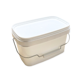
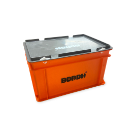
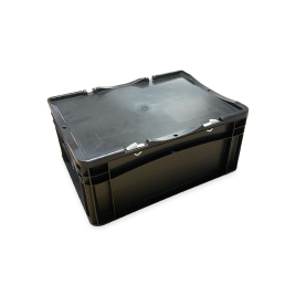
BORGH large packages are designed in a durable, yet multifunctional way. The consumer is always able to reuse the packages for any purpose he sees fit. Smaller packages are made of high-quality cardboard which can endure most of the hazards it faces during its lifespan.
10
Borgh projects
The Borgh Projects logo is the cornerstone of our brand identity, serving as the primary visual element that represents our company. The logo is uniquely designed with the company name resembling a plug, symbolizing connectivity and innovation.
Logo introduction
Logo application
Full logotype
The BORGH® Projects corporate logo consists of the logo type. The logo type features our company name, “BORGH® Projects,” designed to symbolizing our primary product and our dedication to providing innovative and secure fastening solutions.
Recommended formats are:
.eps, .ai, .png
Attention: The use of stylised, animated, hand-drawn or other versions of an unofficial logo is not permitted. This undermines the logo system and brand consistency. Please contact BORGH Trademark Licensing if you have any questions or need further assistance.
Logo
Carefully selected for its modern yet refined, highly legible style, enhanced by the use of capitals in the corporate colour of orange.
Orange version
This will be used when the background color is orange
Dark version
This will be used when the background color is dark.
Construction,
clear space and computation
It is important to keep the corporate mark clear of any other graphic elements. To regulate this, an exclusion zone has been created around the corporate mark. This exclusion zone indicates the closest any other graphic element or message can be positioned in relation to the mark, the symbol itself and our company name. They have a fixed relationship that should never be altered in any way.
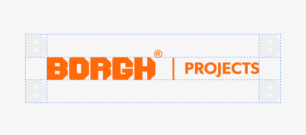
Definition: Whenever you use the logo, it should be surrounded with clear space to ensure its visibility and impact. No graphic elements of any kind should invade this zone.
Computation: To work out the clear space take the height of the logo and divide it in half.
( clear space = height / 2 )
Application on backgrounds
The best way to incorporate the brand logo on different colored backgrounds is to use it in a white color setting. on fotographic backgrounds, it is manditory to allow the logo to be visible by any means necessary. The higher the contrast the better, but the color setting white is also recommended in this application.

Photo version
Orange
Anthracite
Grey
11
FaçaFixings
The FaçaFixings logo is the cornerstone of our brand identity, serving as the primary visual element that represents our company. Our logo is uniquely designed to embody our innovative approach, much like our specially developed screws that ensure durable and secure façade cladding installations. The innovative design guarantees long-term stability and safety for every façade construction.
Logo introduction
Logo application
Full logotype
The FaçaFixings corporate logo consists of the logo type. The logo type features our company name, “FaçaFixings,” designed to symbolizing our primary product and our dedication to providing innovative and secure fastening solutions.
Recommended formats are:
.eps, .ai, .png
Attention: The use of stylised, animated, hand-drawn or other versions of an unofficial logo is not permitted. This undermines the logo system and brand consistency. Please contact BORGH Trademark Licensing if you have any questions or need further assistance.
Logo
Carefully selected for its modern yet refined, highly legible style, enhanced by the use of capitals in the corporate colour of orange.
Orange version
This will be used when the background color is orange
Dark version
This will be used when the background color is dark.
Construction,
clear space and computation
It is important to keep the corporate mark clear of any other graphic elements. To regulate this, an exclusion zone has been created around the corporate mark. This exclusion zone indicates the closest any other graphic element or message can be positioned in relation to the mark, the symbol itself and our company name. They have a fixed relationship that should never be altered in any way.
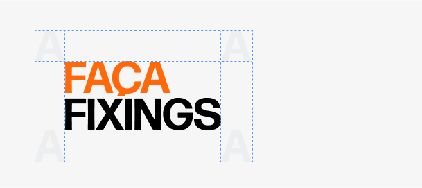
Definition: Whenever you use the logo, it should be surrounded with clear space to ensure its visibility and impact. No graphic elements of any kind should invade this zone.
Computation: To work out the clear space take the height of the logo and divide it in half.
( clear space = height / 2 )
Application on backgrounds
The best way to incorporate the brand logo on different colored backgrounds is to use it in a white color setting. on fotographic backgrounds, it is manditory to allow the logo to be visible by any means necessary. The higher the contrast the better, but the color setting white is also recommended in this application.

Photo version
Orange
Black
12
Contact
Get in touch with BORGH
Contact
Remco Nagtegaal
Marketing Manager
Address
De Steiger 71-73
1351 Almere-Haven
T: +31 (0) 36 53 59 333
M: +31 (0) 6 40 99 65 49
E: remconagtegaal@borgh.net
